✨ Live: Holiday Sale for The Software Essentialist - Ends in 4 days.
When I was first starting out, I kept feeling like I was missing something fundamental. Even after university… even after working professionally… there was still this gap no one was talking about.
Everyone was teaching frameworks and libraries. But almost no one was teaching how to think — how to design systems from first principles, how to architect clean software, how to test intelligently, how to build something you're actually proud of.
So I spent the next several years trying to piece it all together. Books, papers, articles, endless experiments, breaking my own code, rebuilding it, seeking mentors, coaching developers 1 on 1, and eventually discovering the mental models that actually matter.
That's why I created The Software Essentialist. I wanted to build the last programming course you'll ever need — so you can stop hunting through random tutorials and finally master the craft.
This is the course I spent years building — the same one hundreds of developers have used to:
- break out of "expert junior developer" purgatory
- jump from junior → senior
- build cleaner, more scalable systems
- design with clarity instead of chaos
- and even start their own SaaS companies (seriously)
Inside, you'll go through a 12-week, self-paced, hands-on curriculum broken into 5 Phases, where you'll learn how to apply the 12 Essentials of testing, design, and architecture — the deeper patterns behind TDD, BDD, DDD, and clean design that stay relevant no matter what language or framework you use.
If you want to sharpen your thinking, level up your craft, and finally step into senior-level clarity… now's the time.
✨ Get 30% off before Dec 31st
Learn more about the course here.
To your craftship,
Khalil
Brutalist Web Design

Readers of khalilstemmler.com either love or hate the design of the site. When I was designing the site, I knew that I wanted to draw a little bit of inspiration from brutalist web design. The challenge is that most brutalist work can be very polarizing.
What is brutalism?
The term brutalism is derived from the French béton brut, meaning “raw concrete”.
Concrete brutalist buildings often reflect back upon the forms used to make them.
Take the following image of the Ministry of Education in Lima, Peru. It's a Jenga-looking building that is unmistakeably hard to not realize is built out of several blocks of concrete.

Ministry of Education, Lima, Peru, 2012, by DLPS
Not a lot of architecture, artwork or any finished product for that matter, sets out to draw blaring attention to the tools used to create it.
Here's another one in my neighboring city of Toronto. Most people don't mind working in brutalist office, but to see a home that looks like the architectural planning could have been an avid Minecraft player, is pretty unique. Personally, I love it. I'd love to live here.
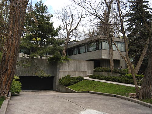
Brutalist home in Toronto, from ontarioarchitecture.com
Last one, City Hall in my hometown, Brantford, Ontario. I remember skateboarding around here as a kid. From a young age, something drew me to this area with those interlocking rectangular shapes made from concrete, though I never quite knew why.

City Hall in Brantford, Ontario ontarioarchitecture.com
Most brutalist buildings are made from raw concrete, so it's interesting to see how raw-ness applies to the web. 1
What is brutalist web design?
In it's ruggedness and lack of concern to look comfortable or easy, Brutalism can be seen as a reaction by a younger generation to the lightness, optimism, and frivolity of today's web design. - brutalistwebsites.com
In some ways, the recent trend of implementing brutalism in design stems back to the early days of the web. Back then, websites were brutal because they had to be. In present times, going brutal is more of a way to stand out and rebel against the squeaky-clean designs that cover the web today.
You know when you're looking at a brutalist website. Here are a few examples from brutalistwebsites.com.
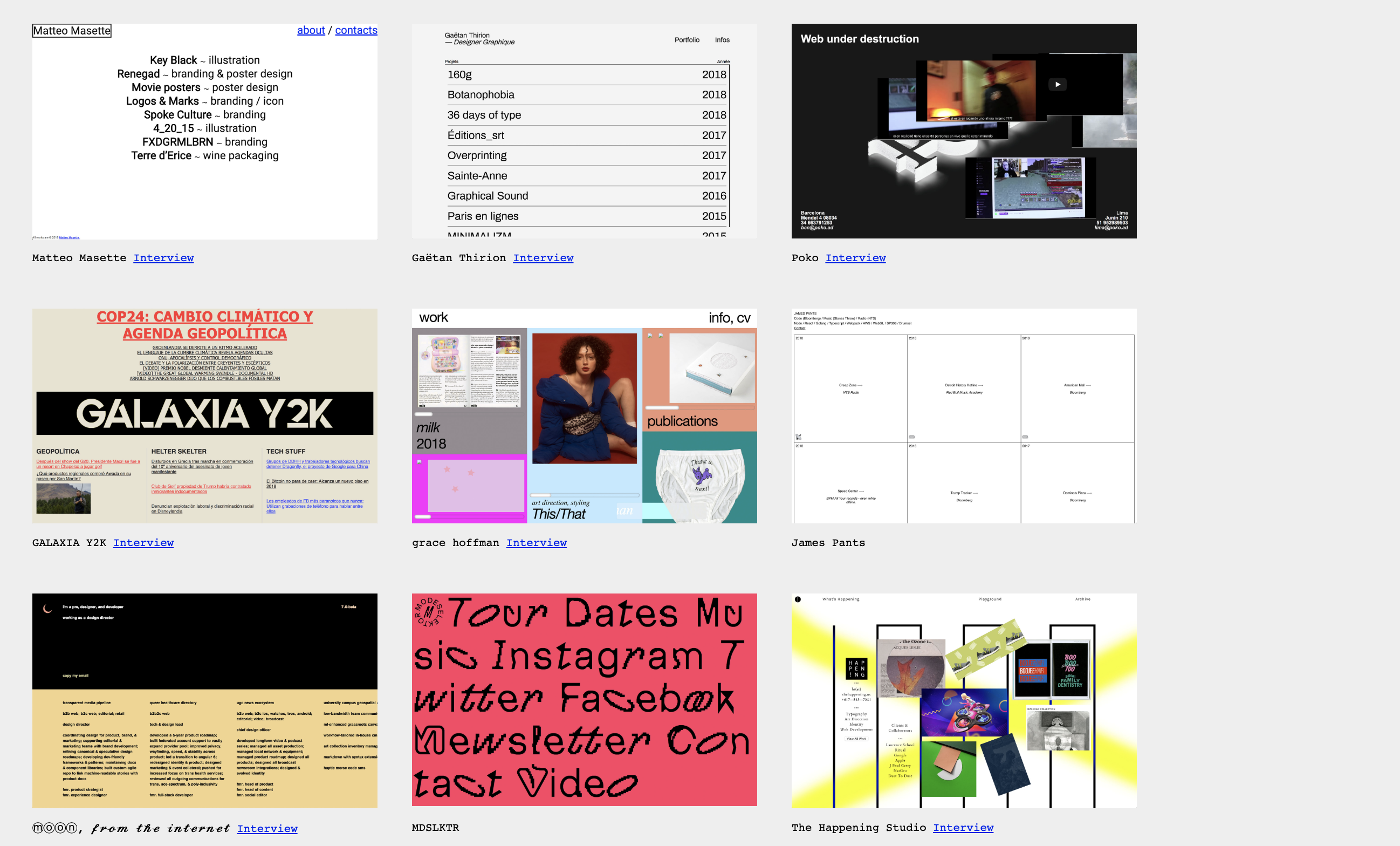
Several brutalist websites @ brutalistwebsites.com
The experience you get from a deconstructed brutalist website is similar to the one we get when we look at buildings obviously made from slabs of concrete. We really pay notice to the HTML, CSS and JavaScript that came together to create it.
Brutalist works reflect back upon the forms used to make them
Brutalism vs. convention
If there's anything we've noticed so far about the brutalist architecture and web design, it's that brutalist works often challenge the popular conventions.
Let's talk about landing pages.
Landing page design
Effective landing page design can make or save a company lots of money. My favourite author on the internet, Julian Shapiro has written extensive handbooks on the formula behind landing page design.
Here's his diagram illustrating the formula to high-converting landing pages (used by Stripe and other big-name YC startup companies).
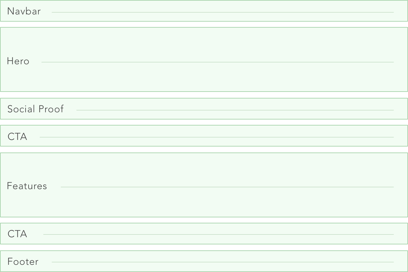
Effective Landing Page templates, courtesy of julian.com
This is pretty much what we've grown accustomed to looking at for homepages of businesses on the internet in 2019. Stripe's landing page is exemplary.
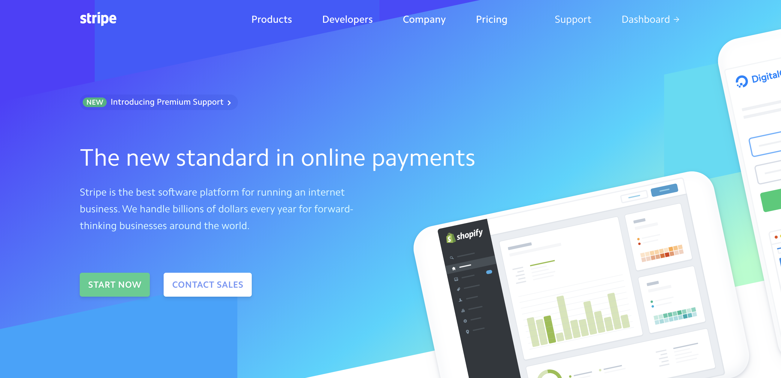
In order to make money on the internet, landing page design, copywriting, and conversion rate optization are topics you could spend a lot of time trying to master. It's also what companies in the business of making money invest a lot of capital on.
Brutalist websites however, trade in attention to today's popular conventions (such as flat-design, 3x3 cards, and minimal or geometrically pleasing backgrounds) for raw and memorable web experiences.
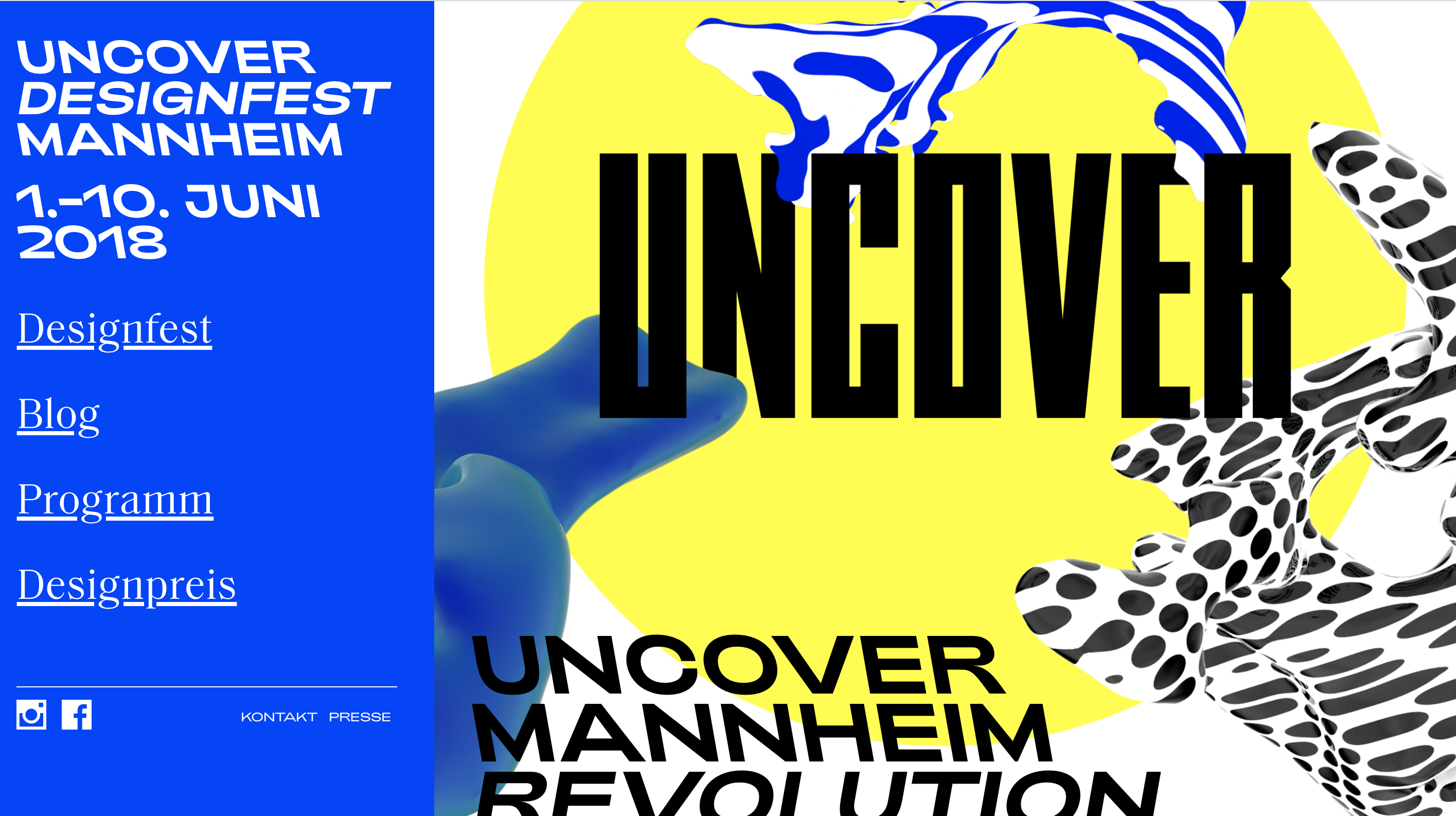
While it may not be the optimal design for those attempting to selling something, because users might be less familiar with how your site handles navigation and other standard web conventions, it can either be refreshing (because it enables users to just go along for the ride) or completely aggravating.
Portfolio websites and interactive experiences
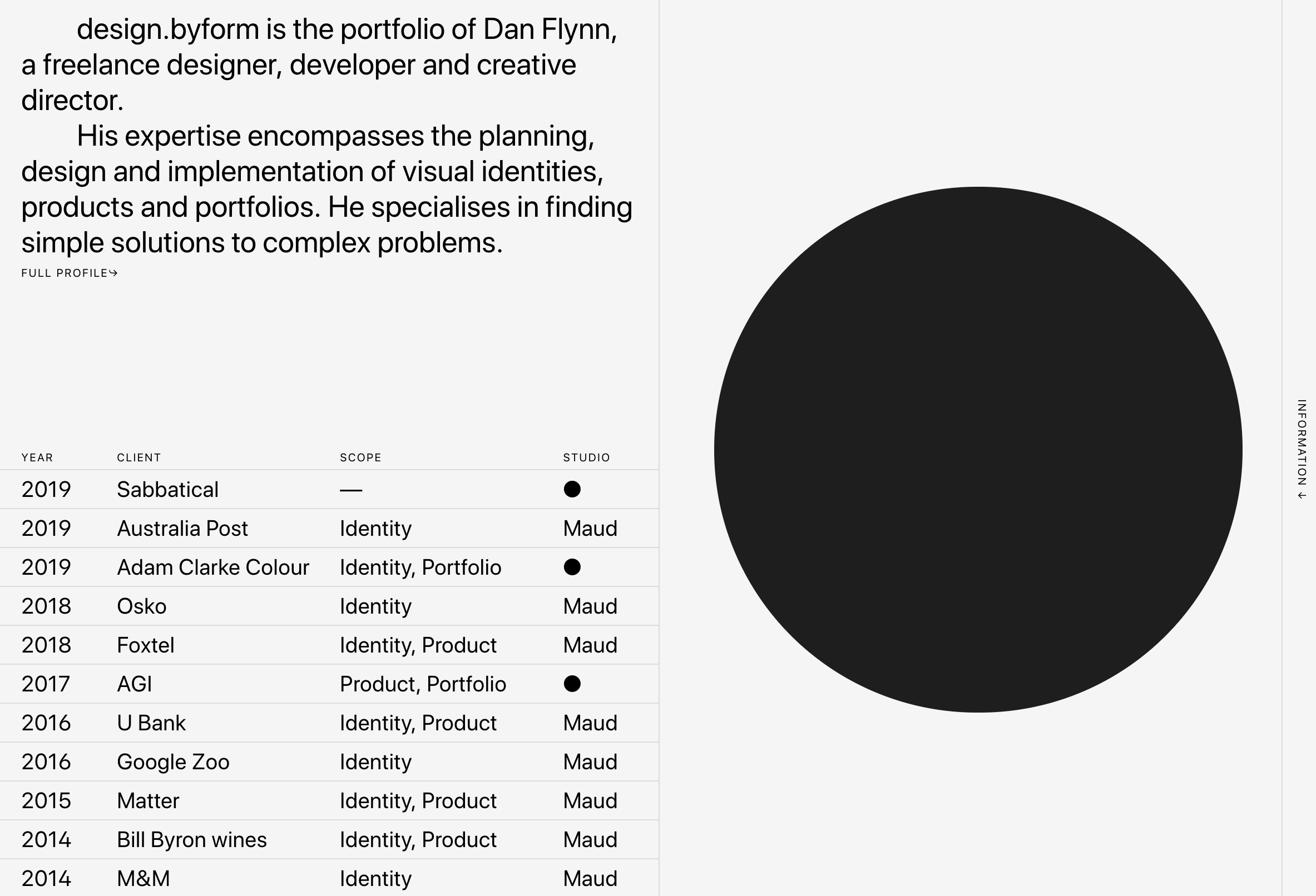
True brutalist websites seem to work better when they serve as porfolios for artists and designers or homepages for musicians. I think that works well because the transaction of first impression is more important and has potential to leave an impact deeper and more valuable than any monetary or business transaction. Guess it depends on who's asking.
Here are a few interesting ones.

Rules of Brutalist Web Design
The Guidelines for Brutalist Web Design by David Bryant Copeland state that:
- Content is readable on all reasonable screens and devices.
- Only hyperlinks and buttons respond to clicks.
- Hyperlinks are underlined and buttons look like buttons.
- The back button works as expected.
- View content by scrolling.
- Decoration when needed and no unrelated content.
- Performance is a feature.
Brutalism in art and music
I've always been attracted to raw-ness in art, design, and music.
Personally, I'm borderline obsessed with music of the late-1970s / early-80s with ties to the avante-garde no wave scene in New York. And I'm equally obsessed with the novel recording techniques and expressionist vocalisms of several English and Australian post-punk groups.
In a similar vein to brutalism, my all-time favourite bands come from a lineage of blatant disregard for the popularly agreed-upon constructs of what music should sound like. It's the type of music that reflects back upon the instruments used to create it.
The Pop Group
For me, it starts with The Pop Group, an English band formed in the peak era of post-punk.
The ironically named Pop Group is a discordant band writing songs where almost every instrument is independently fighting for attention, and it reflects back towards the listener.
In popular music (take Madonna's "Lucky Star", for example), a lot of effort is focused towards making all the instruments compliment each other. In other words, a good pop song is one you can dance to, is free of awkward silences, and nothing quite sticks out at you awkwardly.
Madonna's "Lucky Star". An excellent pop song.
On "Lucky Star", there are several instruments in the mix strategically placed and equalized to sweeten the resulting pop song. Sure, there's a lot going on, but none of it is discordant.
"[Madonna] was [initially] unhappy with the whole [album], so I went in and sweetened up a lot of music for her, adding some guitars to 'Lucky Star', some voices, some magic... I just wanted to do the best job I could do for her. When we would playback 'Holiday' or 'Lucky Star', you could see that she was overwhelmed by how great it all sounded." — John Benitez, producer of Madonna's first album, talking about Madonna and the album. 2
Now take a song like "Snowgirl", off of The Pop Group's debut album, Y, who Stylus Magazine wrote that the "political punk tunes are deconstructed so that only the skeleton remains, and weaving between those bare bones are some of the nastiest sounds ever made." 3
The Pop Group's "Snowgirl". A discordant piano ballad accompanied by guitars that sound like they're on the verge of unrepairable destruction, angular bass lines, and delay drenched drums and vocals not uncommon in dub and reggae music.
Pitchfork said, "unlike most of the late-70s' no-wave types (and perennial imitators), The Pop Group were less concerned with eschewing convention than with vehemently eviscerating it."
The album has had a lasting impact, with artists such as the Sonic Youth and Nick Cave citing the album as an influence on their work.
Nick Cave would go on to create "The Birthday Party", one of the most influential post-punk bands of the 70s and early 80s.
Watch Sonic Youth perform "The Burning Spear" live below. Guitarist, Thurson Moore wedges a drumstick inbetween the fret and strings of his guitar and uses another drumstick to get some novel sounds out of the instrument.
Sonic Youth performing "The Burning Spear", the first SY song ever written.
The Pop Group might not be where discordant music started, but for what I spend most of my time listening to, it very well might as well be.
Here's another interesting one from James Chance and the Contortions, no-wave band of the 70s that I describe as a mix between James Brown and The Pop Group.
James Chance and the Contortions are placed under the genres of No wave, punk jazz, avant-funk, dance-punk.
Finally, my favourite band of all time, before Nick Cave went Americana, he was in the influential Birthday Party, which wouldn't exist without The Pop Group.
The Birthday Party's influence has been far-reaching, and they have been called "one of the darkest and most challenging post-punk groups to emerge in the early '80s." - Wikipedia
Sweetening things for public consumption
Unless you're specifically passionate about architecture and aesthetic, it's easy to never notice any of the craftsmanship on the structures that we move between everyday. Although, if you take a walk around the UofT campus in Toronto, you'll have a hard time not noticing the John P. Robarts Research Library.
With respect to web design, the best design is invisible. The principle states that good design is not something the average user looks at and says “wow, that’s a great design!” Good design is something that is easy to use, read and interact with. 4
Brutalist websites built with HTML, CSS, and JavaScript don't aim to mask, sweeten, lighten or smoothen the borders on the rough and ugly edges. Instead, they draw attention to them. That's what makes them interesting and memorable.
Sometimes when things are overly sweet, they tend to alienate us.
My "Brutalist" Junk Jazz playlist
If you're into discordant music, check out one of my playlists titled "Junk Jazz" on Spotify.
- ↩
-
Rooksby, Rikky (2004). The Complete Guide to the Music of Madonna. Omnibus Press. ISBN 0-7119-9883-3.
↩ -
Howard, Ed (March 22, 2004). "Top 101-200 Albums Favorite Albums Ever". Stylus Magazine. Retrieved September 11, 2014.
↩ -
DesignShack ("10 Reasons Why the Best Design Is Invisible")
↩
✨ Live: Holiday Sale for The Software Essentialist - Ends in 4 days.
When I was first starting out, I kept feeling like I was missing something fundamental. Even after university… even after working professionally… there was still this gap no one was talking about.
Everyone was teaching frameworks and libraries. But almost no one was teaching how to think — how to design systems from first principles, how to architect clean software, how to test intelligently, how to build something you're actually proud of.
So I spent the next several years trying to piece it all together. Books, papers, articles, endless experiments, breaking my own code, rebuilding it, seeking mentors, coaching developers 1 on 1, and eventually discovering the mental models that actually matter.
That's why I created The Software Essentialist. I wanted to build the last programming course you'll ever need — so you can stop hunting through random tutorials and finally master the craft.
This is the course I spent years building — the same one hundreds of developers have used to:
- break out of "expert junior developer" purgatory
- jump from junior → senior
- build cleaner, more scalable systems
- design with clarity instead of chaos
- and even start their own SaaS companies (seriously)
Inside, you'll go through a 12-week, self-paced, hands-on curriculum broken into 5 Phases, where you'll learn how to apply the 12 Essentials of testing, design, and architecture — the deeper patterns behind TDD, BDD, DDD, and clean design that stay relevant no matter what language or framework you use.
If you want to sharpen your thinking, level up your craft, and finally step into senior-level clarity… now's the time.
✨ Get 30% off before Dec 31st
Learn more about the course here.
To your craftship,
Khalil
Stay in touch!
Join 20000+ value-creating Software Essentialists getting actionable advice on how to master what matters each week. 🖖
View more in Web Design